How to Plot Multiframe Using Matplotlib#
Introduction#
First, we need to import the Matplotlib library
import matplotlib.pyplot as plt
from matplotlib.gridspec import GridSpec
For the data, we can generate a random data by using Numpy
import numpy as np
[ ]:
import matplotlib.pyplot as plt
from matplotlib.gridspec import GridSpec
import numpy as np
We create two variable random data \(x\) and \(y\) with 1000 of data.
[ ]:
np.random.seed(42)
x = np.random.normal(0,1,1000)
y = np.random.exponential(1,1000)
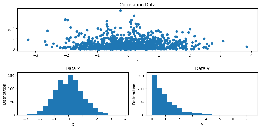
Based on this data, suppose we want to illustrate the correlation between both data and the distribution for each data. So, we then have trhee figures will be showed them in one frame. We can do this as follows
[ ]:
# PLOT
fig = plt.figure(figsize=(10,5))
gs = GridSpec(2, 2, figure=fig)

ax1 = fig.add_subplot(gs[0,0:])
ax1.scatter(x, y)
ax1.set_xlabel('x')
ax1.set_ylabel('y')
ax1.set_title('Correlation Data')

ax2 = fig.add_subplot(gs[1,0])
ax2.hist(x, bins=20)
ax2.set_xlabel('x')
ax2.set_ylabel('Distribution')
ax2.set_title('Data x')

ax3 = fig.add_subplot(gs[1,1])
ax3.hist(y, bins=20)
ax3.set_xlabel('y')
ax3.set_ylabel('Distribution')
ax3.set_title('Data y')

plt.tight_layout()
Explanation#
As we can see on the PLOT cell above, first we have to define aa figure object,
fig = plt.figure(figsize=(10,5)), along with the figure size.We then create the
GridSpecobject for thefig,gs = GridSpec(2, 2, figure=fig). TheGridSpecrequires a number of rows and columns, for this example, we adjust to nrows = 2 and ncols = 2We create the first axis object of the
figby adding theadd_subplotmethod,ax1 = fig.add_subplot(gs[0,0:]). This method require theGridSpecobject (gs) and expected index number. For example,gs[0,0:]means that the first figure will be depicted at the first row and entire columns, see on the Correlation Data plot.We then create the second axis object of the
fig. On this time, we should define different axis oobject name than previous,ax2 = fig.add_subplot(gs[1,0]). This graphic will showed at the second row and the first column, see on the Data x.The same method for plotting the Data y as previous one, where the index would be at the second rows and the second columns, `ax3 = fig.add_subplot(gs[1,1]).
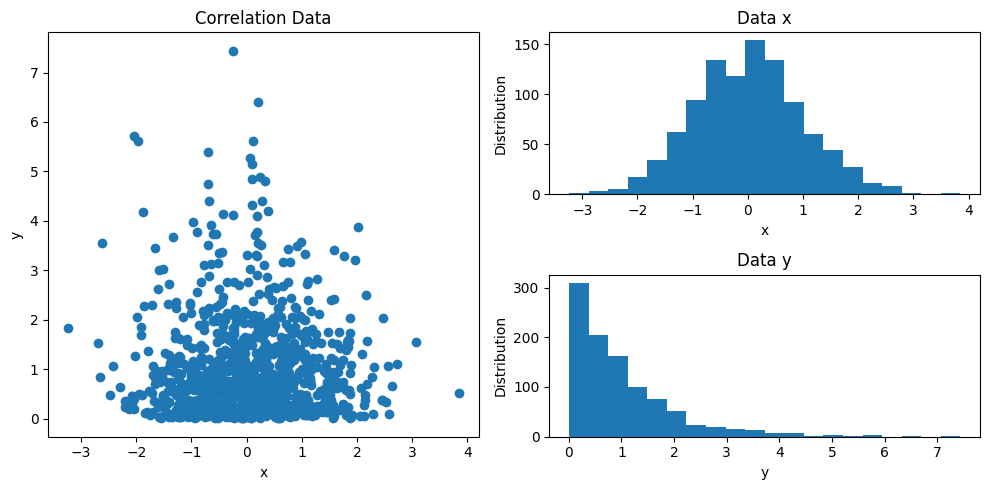
We can modify the layout of the figures as like as we want to be, may be something like this
[ ]:
# PLOT
fig = plt.figure(figsize=(10,5))
gs = GridSpec(2, 2, figure=fig)

ax1 = fig.add_subplot(gs[0:,0])
ax1.scatter(x, y)
ax1.set_xlabel('x')
ax1.set_ylabel('y')
ax1.set_title('Correlation Data')

ax2 = fig.add_subplot(gs[0,1])
ax2.hist(x, bins=20)
ax2.set_xlabel('x')
ax2.set_ylabel('Distribution')
ax2.set_title('Data x')

ax3 = fig.add_subplot(gs[1,1])
ax3.hist(y, bins=20)
ax3.set_xlabel('y')
ax3.set_ylabel('Distribution')
ax3.set_title('Data y')

plt.tight_layout()
Thank you for reading this article. I hope this article can help you out to make up your illustration data. See you on the next article.